Is your feature request related to a problem? Please describe.
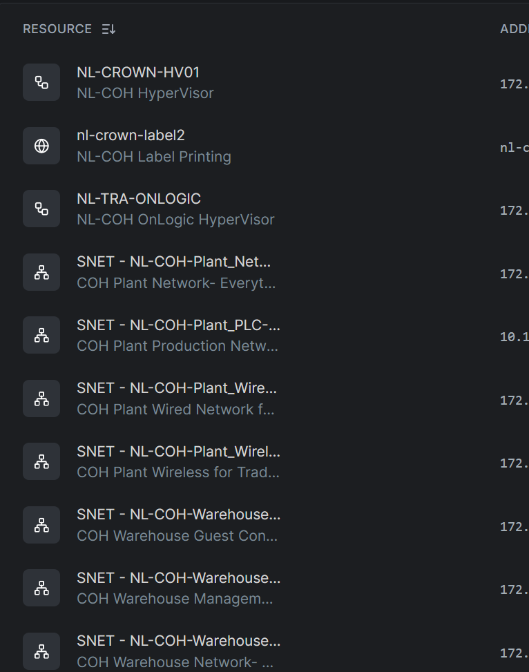
The Networks resources page is hard to see the Resource name, currently have to hover, or open the item to see longer names. even with a wide column on larger screens, it only displays 1/3 or 1/2 of the column width.
Describe the solution you’d like
Draggable column widths where the cell text/value scales.
Describe alternatives you’ve considered
maybe using tags to categorize network devices, therefore reducing the Resource name. Ie, laptop, desktop, server, host, vm, managed, unmanaged etc
Additional context
Below, half of the names are cut off, with half of the cell populated for the width of the column.
Also please add “remember” for “rows per page”. 10 rows as a default are not enough. Either 50 or continuous scrolling as default please.